The paper products you provide for your customers can make a lasting impression. We call it “the visiting card of a good house.” You’ve chosen to print on quality materials and have selected the print method that suits the old-fashioned refinement or modern style of your establishment. But, don’t forget to put that same attention-to-detail into designing your promotional materials. Whether your paper products feature a simple branded design or you’re creating a custom design from scratch, here is our advice on creating visually pleasing promotional materials.
Maintaining Brand Integrity
As an advertising vehicle for their brand, many establishments use a clean logo design across all of their printed paper products. If this is the direction you choose, it’s important that you maintain the integrity of your brand by ensuring your printed materials meet all of your brand standards.
Perhaps you have a brand style guide that was created when your logo was first designed. A style guide gives instructions on keeping your logo consistent across all advertising platforms. If a style guide doesn’t exist, keep these points in mind.
- Keep the visual color palette of the brand consistent
- utilize the chosen brand colors, whether full color or one color
- do not change colors
- Keep the design integrity of the brand consistent
- do not move or rearrange objects in the logo
- do not skew, stretch, or rotate the logo
- Maintain the approved typography of the brand
- do not stray from the approved font family and styles
- do not add additional text to your logo
Creating a Custom Design
When you create custom artwork as part of designing your promotional materials, you’ll go beyond a logo or tagline. With a custom design, you’ll be adding a little personality to your printed paper products. A few basic rules of design will ensure that your promotional materials are aesthetically pleasing and are a positive representation of your brand.
Choose A Color Scheme that Wows
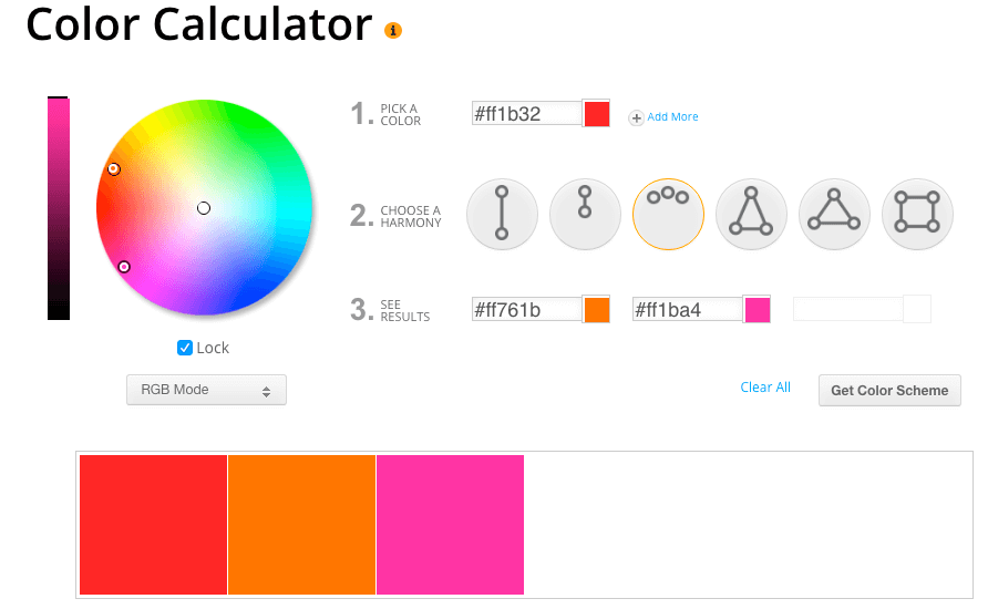
Even with a custom design, you’ll want to reinforce your brand standards by starting with one of your chosen brand colors. After identifying your brand color, where do you go from there? Believe it or not, there is a bit of science behind the art of design. This color calculator tool allows you to enter a base color and choose a color scheme (complementary, monochromatic, analogous/adjacent, or triadic), and it will return an appropriate palette of colors.
Be Smart with Your Fonts
Printed cocktail napkins, glass cover caps, and coasters offer a relatively small billboard for your advertising message, so don’t complicate things by adding too many fonts into your design. Choosing two or three fonts – at the most – will result in a design that’s not too busy.
Here are some additional guidelines for making smart font choices:
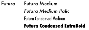
- Choose from the same font family – a font family will feature fonts in differing weights, styles, and cases that will offer contrast but still compliment each other.
- Mix serifs and sans serif fonts – serif fonts have “feet,” or a finishing stroke, at the end of each line, which sans serif fonts do not have.
- Avoid fonts that are too similar – make sure the fonts you choose are not too similar or your design will lack interest.